Living Room Colour Ideas – A Flair for Colour

Louise Hide’s Mid-Century Makeover in Billericay

If you’re looking for living room colour ideas to transform your space, this project is a perfect example. When Louise Hide visited the Burlwood & Lye studio, she was ready to breathe new life into her living room and hallway with a scheme that felt expressive yet welcoming.

With rich navy walls due for a refresh, she wanted a palette that would still feel warm and enveloping but without overpowering the space. Her plan to colour-drench both walls and ceiling meant finding shades that would soften the edges and bring cohesion throughout.

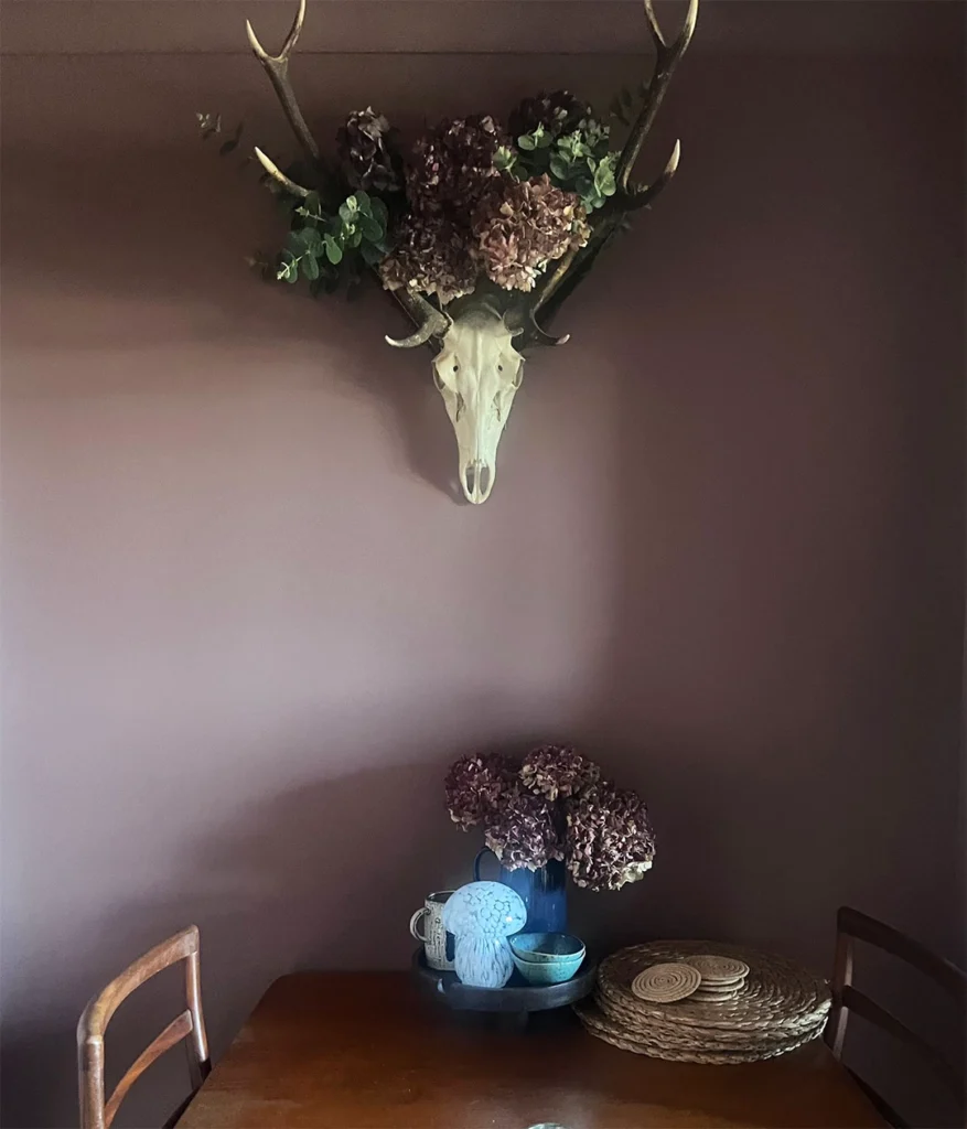
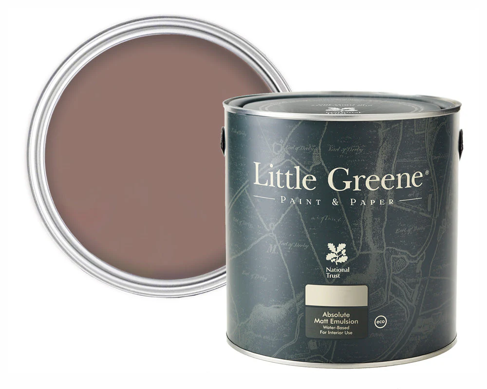
Enter Little Greene’s Nether Red (315) a rich red-pink with depth and personality. Paired with Louise’s striking mid-century pieces, it immediately felt like a natural fit.

“I’ve always felt that warm red shades add a cosy, cocooning effect to a room. They create an inviting, calming atmosphere that helps a space feel like home.”

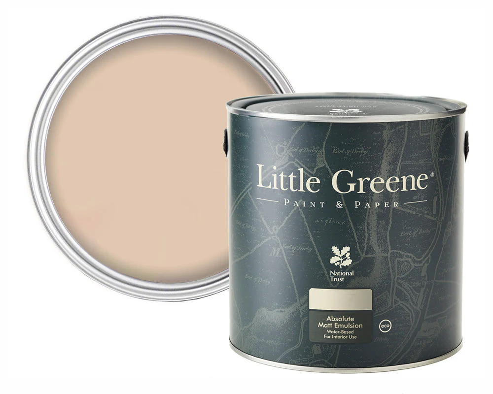
To complement Nether Red, we layered in Castell Pink (314) from Little Greene’s Re:mix collection, using it in the hallway and on the fireplace to enhance the flow between rooms.

The result? an effortlessly cosy, characterful home where colour leads the conversation.

“It’s the hub of our house. We wanted a space that felt relaxed and intimate…somewhere we can truly unwind as a family.”

With a kitchen renovation planned for next year, Louise also wanted a scheme that could evolve with their home. The tones we chose offer flexibility allowing her to carry warmth and natural texture into the next phase of the design.

Whether you’re planning a bold refresh or creating colour continuity throughout your home, our team is here to help guide your ideas from concept to completion – just like we did for Louise.

About The Little Greene Paints

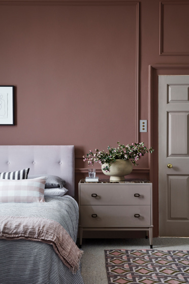
A cosy bedroom with mauve walls, a tufted light grey headboard, a neatly made bed with layered pillows and blankets, a beige chest of drawers with a vase of flowers, and a patterned rug on the floor.
Nether Red (315) is part of Little Greene’s National Trust Stone collection, inspired by the rich mud-red sandstone of Nether Alderley Mill near Alderley Edge, Cheshire, a site with over 600 years of history. Its warm earthy tone brings depth and character to both classic and contemporary interiors.
A minimal desk setup with books, stationery, an open magazine, a potted plant, and a blank framed picture on a beige wall. The scene is simple and tidy, with neutral and natural tones.

Re:mix Castell Pink (314) is a gorgeous soft pink shade that adds instant warmth. This plaster-like shade is taken from a reading of the sculptural stonework which surrounds the great stairwell at Penrhyn Castle in North Wales.

This upcycled paint finish is one of twenty Little Greene shades in the Re:mix

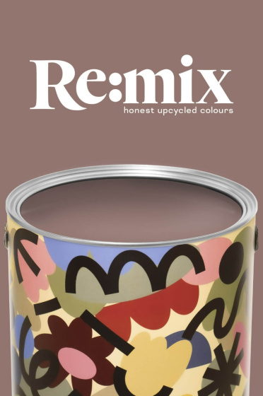
A paint tin with colourful, abstract patterns sits against a mauve background. Above it, white text reads Re:mix honest upcycled colours. The paint in the tin matches the background colour.
What is Re:mix?
  • Made using recycled paint
  • Handmade in the UK
  • Matt emulsion finish for walls and ceilings
  • Available in 20 colours

Re:mix sees damaged and unwanted stock expertly blended and reformulated to create a beautiful matt finish for interior walls and ceilings.

Nether Red and Castell Pink are both available in the Little Greene Re:mix collection. To test either colour, please purchase a Sample Pot in our Absolute Matt Emulsion finish.

Share the Post:
Scroll to Top